Case study: Visual rebranding including Logo and Website Design: Heritage and Aviation
Client: Brighton City Airport
Project name: Brighton City Airport Rebrand
Logo objectives:
- Part of a Major Rebrand
- Celebrate the building’s iconic Art Deco design
It has been an absolute pleasure to work with Vicky Vaughan at the Brand Surgery. We’re delighted with our new logo and website which, thanks to Vicky’s creative flair and technical talents, successfully met the brief to be clean and modern, whilst capturing the airport’s rich heritage. Thank you, Vicky, for your adaptability and patience while working with a team with little marketing experience, who regularly changed their minds! We highly recommend the Brand Surgery.
Elevating Airport Branding:
Brighton City Airport’s Art Deco Transformation
We’re excited to showcase our collaboration with Brighton City Airport, a hub for commercial and pleasure pilots, business clients, aircraft charter customers, day trippers, and local residents.
First Stop: Stakeholder Workshop
At The Brand Surgery, we prioritise understanding our clients’ unique needs and aspirations. Tasked with rebranding Brighton City Airport’s brand identity, we held a comprehensive stakeholder workshop via Zoom to gather crucial insights.
This workshop revealed a complex mix of perspectives. Leisure Pilots, Commercial Pilots, Aircraft Charter Businesses and Pilot Training Businesses shared their passion for the iconic airport, alongside a desire for a harmonious relationship with the local community. These insights were pivotal in shaping our approach.
Logo Design Approach: Capturing the Spirit of Aviation and Heritage
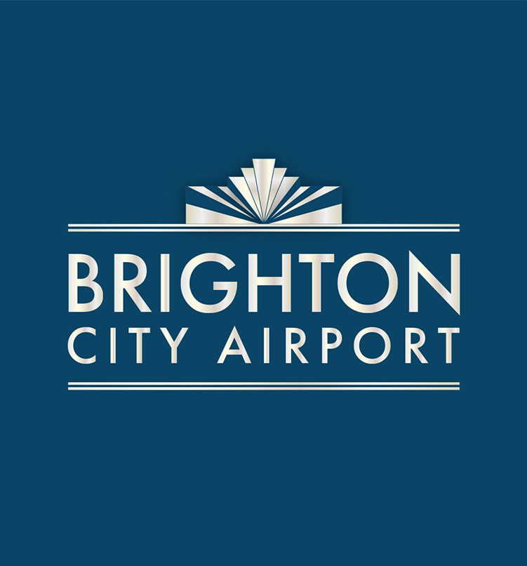
Moving beyond the expected aircraft-centric design, our research highlighted the airport’s iconic Art Deco architecture as a shared point of pride. We embraced this architectural charm, crafting a logo and website that represents both the thrill of aviation and the elegance of Art Deco.
This unique logo intertwines the airport’s architectural silhouette with classic Art Deco motifs, creating a visually striking emblem. To enhance its sophistication, we incorporated a platinum effect, offering versatility with different colour palettes for various applications including Promotional Gifts and Signage, especially for the Executive Lounge.
Implementation and Future Plans
We are thrilled to announce the impending launch of the New Logo across the airport’s Digital and Physical Platforms. Our team’s dedication and expertise have been instrumental in aligning this project with our passion for heritage and aviation branding.
Get in Touch for Tailored Branding Solutions for Aviation and Heritage
If your airport or heritage business seeks a branding transformation that truly reflects its unique character, reach out to us. Let’s discuss how we can let your brand’s identity soar with vibrant and distinctive visual branding.
Conclusion: A Fusion of Heritage and Modernity in Branding
Creating a brand identity for Aviation and Heritage Sectors demands a nuanced understanding of Diverse Stakeholder Groups. By harmonising these perspectives and infusing iconic architectural elements, we design logos that not only captivate but also tell a story, bridging the gap between tradition and contemporary appeal.
Join us for more explorations in branding where history and innovation meet. Stay tuned for further updates and inspiring stories from The Brand Surgery.


