fbpx

Use our Slider Functionality to Reveal Before & After Logo Transformations

Welcome to our Big Reveal page, where transformations come to life! Our clients love how we elevate their image. Here, you’ll witness, first-hand, the remarkable Before and After logo design and visual branding transformations over 20 years. Notice how most of our logos have stood the test of time, boasting over a decade of relevance. This longevity builds trust and consistency, offering superb value and maximizing your marketing investment. Slide the reveal bars to view Before and After Logo Transformation. Click to read more information.

BRIGHTON CITY AIRPORT: It has been an absolute pleasure to work with Vicky Vaughan at the Brand Surgery. We’re delighted with our new logo and website which, thanks to Vicky’s creative flair and technical talents, successfully met the brief to be clean and modern, whilst capturing the airport’s rich heritage. Thank you, Vicky, for your adaptability and patience while working with a team with little marketing experience, who regularly changed their minds! We highly recommend the Brand Surgery. Bridget S.

Original Brighton City Airport Logo: A traditional design featuring classic aviation elements, reflecting the airport's heritage before the 2023 redesign.Original Brighton City Airport Logo: A traditional design featuring classic aviation elements, reflecting the airport's heritage before the 2023 redesign.

BOSS CONTROLS TESTIMONIAL: Vicky has been leading our marketing direction since 2016 and during that time we have tripled in size. She also designed our logo, website, company presentations and our brochure. Vicky makes marketing an enjoyable topic, and I am very pleased to recommend her to other businesses who are serious about growing.” Mark Berwick, Managing Director, Boss Controls. 

Current 'BOSS Controls' logo featuring a stylized measurement control symbol, representing the company's expertise in managing various environmental factors like temperature and humidity. The logo combines modern typography with an icon illustrating precision and control in a sleek, contemporary designCurrent 'BOSS Controls' logo featuring a stylized measurement control symbol, representing the company's expertise in managing various environmental factors like temperature and humidity. The logo combines modern typography with an icon illustrating precision and control in a sleek, contemporary design
Original Brighton City Airport Logo: A traditional design featuring classic aviation elements, reflecting the airport's heritage before the 2023 redesign.Original Brighton City Airport Logo: A traditional design featuring classic aviation elements, reflecting the airport's heritage before the 2023 redesign.

BRIGHTON CITY AIRPORT: “It has been an absolute pleasure to work with Vicky Vaughan at the Brand Surgery. We’re delighted with our new logo and website which, thanks to Vicky’s creative flair and technical talents, successfully met the brief to be clean and modern, whilst capturing the airport’s rich heritage. Thank you, Vicky, for your adaptability and patience while working with a team with little marketing experience, who regularly changed their minds! We highly recommend the Brand Surgery.”

Current 'BOSS Controls' logo featuring a stylized measurement control symbol, representing the company's expertise in managing various environmental factors like temperature and humidity. The logo combines modern typography with an icon illustrating precision and control in a sleek, contemporary designCurrent 'BOSS Controls' logo featuring a stylized measurement control symbol, representing the company's expertise in managing various environmental factors like temperature and humidity. The logo combines modern typography with an icon illustrating precision and control in a sleek, contemporary design

BOSS CONTROLS: In 2016, we spearheaded a significant rebranding for Boss Controls, formerly known as Carrob Controls. BOSS, standing for Building Optimisation Systems and Solutions, reflects our strategic name change and branding efforts. Along with the rebranding, we designed their website, which continues to thrive. This project highlights our commitment to long-lasting value and innovative solutions.

New Dome Cinema logo, elegantly combining modern design with heritage elements. Features a unique icon symbolizing the iconic cinema, part of a family of 8 cohesive logos, each celebrating the cinema's rich historyNew Dome Cinema logo, elegantly combining modern design with heritage elements. Features a unique icon symbolizing the iconic cinema, part of a family of 8 cohesive logos, each celebrating the cinema's rich history

DOME CINEMA WORTHING: We met Vicky from Brand Surgery last year. In that time she has created a wonderful logo for The Dome Cinema which is in keeping with our lovely building. Vicky has been very easy to work with, and I look forward to continuing our relationship into the future. Well done Vicky. Paul Jervis.

Revamped logo for Majestic Cinema in King’s Lynn, blending contemporary design with elements reflective of its historic heritage. The logo forms part of a suite, symbolizing the cinema's enduring legacy and architectural elegance.Revamped logo for Majestic Cinema in King’s Lynn, blending contemporary design with elements reflective of its historic heritage. The logo forms part of a suite, symbolizing the cinema's enduring legacy and architectural elegance.

MAJESTIC CINEMA, KING’S LYNN: We’ve reimagined the Majestic Cinema’s logo to celebrate its rich heritage and iconic status in King’s Lynn. Majestic Cinema is part of The Dome Cinema family. The project entailed crafting a series of interconnected logos, closely following brand guidelines, and capturing the unique character of this historic cinema building.

New logo for England and Wales Blind Golf: a contemporary design symbolising inclusivity in sports. It features distinct visual elements that resonate with blind golfers, golfer guides, and funders, enhanced by a colour-coded system for easy brochure selection.New logo for England and Wales Blind Golf: a contemporary design symbolising inclusivity in sports. It features distinct visual elements that resonate with blind golfers, golfer guides, and funders, enhanced by a colour-coded system for easy brochure selection.

EWBG: I have had the pleasure if working with Vicky and The Brand Surgery over the past year. The work we have done together has played a major part in England & Wales Blind Golf’s charity raising its awareness on a national and international level. I would highly recommend The Brand Surgery and have passed their details to more of my business clients.

Refreshed Intech Controls logo: a subtly updated, modern design reflecting advancements in BMS controls and energy efficiency, with a contemporary twist to the color scheme and typography.Refreshed Intech Controls logo: a subtly updated, modern design reflecting advancements in BMS controls and energy efficiency, with a contemporary twist to the color scheme and typography.

INTECH CONTROLS: We rejuvenated the Intech Controls logo with minor, yet effective, changes, keeping the essence of the brand intact while infusing a modern flair. This approach is ideal for businesses like yours seeking a logo refresh without a complete overhaul; something The Brand Surgery excels at.

EWBG: I have had the pleasure of working with Vicky and The Brand Surgery over the past year. The work we have done together has played a major part in England & Wales Blind Golf’s charity raising its awareness on a national and international level. I would highly recommend The Brand Surgery and have passed their details to more of my business clients (Andy Gilford)

New logo for England and Wales Blind Golf: a contemporary design symbolising inclusivity in sports. It features distinct visual elements that resonate with blind golfers, golfer guides, and funders, enhanced by a colour-coded system for easy brochure selection.New logo for England and Wales Blind Golf: a contemporary design symbolising inclusivity in sports. It features distinct visual elements that resonate with blind golfers, golfer guides, and funders, enhanced by a colour-coded system for easy brochure selection.

INTECH CONTROLS: We rejuvenated the Intech Controls logo with minor, yet effective, changes, keeping the essence of the brand intact while infusing a modern flair. This approach is ideal for businesses like yours seeking a logo refresh without a complete overhaul; something The Brand Surgery excels at.

Refreshed Intech Controls logo: a subtly updated, modern design reflecting advancements in BMS controls and energy efficiency, with a contemporary twist to the color scheme and typography.Refreshed Intech Controls logo: a subtly updated, modern design reflecting advancements in BMS controls and energy efficiency, with a contemporary twist to the color scheme and typography.
NFSP National Federations of SubPostmasters original logo - pre 2017NFSP National Federations of SubPostmasters original logo - pre 2017

NFSP: In 2017, we developed a comprehensive visual branding overhaul for The National Federation of SubPostmasters (NFSP). This project encompassed detailed brand guidelines for both print and digital media, innovative logo designs tailored for public and member interactions, and a strategic branding approach. Discover more about this transformative branding project [here].

The Magicman logo, created in 2006, features a professional and dynamic design that effectively represents their repair and restoration services. The logo, with its strong typography and emblem, encapsulates the company's commitment to environmentally friendly solutions in the hotel and cruise ship industriesThe Magicman logo, created in 2006, features a professional and dynamic design that effectively represents their repair and restoration services. The logo, with its strong typography and emblem, encapsulates the company's commitment to environmentally friendly solutions in the hotel and cruise ship industries

MAGIC MAN HARD SURFACE REPAIR: Our design for the Magicman logo in 2006 captures the essence of their innovative and eco-friendly services. The enduring nature of the logo illustrates not just the company’s dedication to quality but also our ability to create lasting brand identities that resonate with clients’ values and market trends.

Casa Ciro's new logo, a striking blend of modernity and tradition, inspired by its unique spaghetti sea motif and sleek wooden interior design. The logo, redesigned in 2004, features fresh colors and shapes, embodying the restaurant's distinctive characterCasa Ciro's new logo, a striking blend of modernity and tradition, inspired by its unique spaghetti sea motif and sleek wooden interior design. The logo, redesigned in 2004, features fresh colors and shapes, embodying the restaurant's distinctive character

CASA CIRO ITALIAN RESTAURANT: Our logo design for Casa Ciro Italian Restaurant was a total transformation, showcasing the establishment’s evolution while staying true to its roots. Crafted two decades ago, it remains a testament to our ability to create lasting, impactful designs that stand the test of time.

The Chartered Marketer logo, symbolising a high level of expertise in marketing. As a Fellow member, this logo represents a commitment to excellence, forecasting trends, and audience understanding in logo design.

Our Chartered Marketer accreditation is more than a title; it’s a testament to our strategic foresight in logo design. This expertise enables us to craft logos that not only meet the current demands but also remain vibrant and effective for years, a clear indicator of our dedication to quality and longevity in our work.”

CASA CIRO ITALIAN RESTAURANT: Our logo design for Casa Ciro Italian Restaurant was a total transformation, showcasing the establishment’s evolution while staying true to its roots. Crafted two decades ago, it remains a testament to our ability to create lasting, impactful designs that stand the test of time.

Casa Ciro's new logo, a striking blend of modernity and tradition, inspired by its unique spaghetti sea motif and sleek wooden interior design. The logo, redesigned in 2004, features fresh colors and shapes, embodying the restaurant's distinctive characterCasa Ciro's new logo, a striking blend of modernity and tradition, inspired by its unique spaghetti sea motif and sleek wooden interior design. The logo, redesigned in 2004, features fresh colors and shapes, embodying the restaurant's distinctive character

Our Chartered Marketer accreditation is more than a title; it’s a testament to our strategic foresight in logo design. This expertise enables us to craft logos that not only meet the current demands but also remain vibrant and effective for years, a clear indicator of our dedication to quality and longevity in our work.”

The Chartered Marketer logo, symbolising a high level of expertise in marketing. As a Fellow member, this logo represents a commitment to excellence, forecasting trends, and audience understanding in logo design.

What have I been up to? Read my latest blogs.

The Brand Surgery creates that ‘reason’ and you are in the right place if you want more kisses.

Launched in 2002 – we’ve been creating kissable brands by making them shine brightly from the inside out.  After all, you want to look good, taste good and have an irresistible and interesting personality, so people keep coming back for more kisses, right?

To create the ‘reason’ why people want to kiss you, we superpower your brand by blending marketing strategy, psychology and creative design.  We achieve this by designing stunning logos, websites and other online and offline marketing collateral. At the same time, we ‘superpower’ the heart and soul of your brand, and to do this, we blend training, coaching with ‘hands on’ marketing solutions.

Our kissable clients include exciting startups through to established SMEs. They have all enjoyed plenty of long kisses and as a result, they have typically tripled in size within two-three years, bucking trends in difficult economic climates.

We take kissing seriously and therefore The Brand Surgery is a CPD accredited training provider, a Fellow Member of the Chartered Institute of Marketing, a Chartered Marketer and a Fellow Member of the Institute of Leadership and Management. This means, you can trust us to make your brand kissable.

Years

Awards

Inside out branding projects

The Brand Surgery works hard to makes your brand shine brightly from the inside out. Without a brand personality, your marketing content will be dull. We help you to create exciting stories and opportunities. These photos capture just a few of our exciting branding projects.

  • Boss Controls have trebled in size since we’ve been working with them in 2016. Inside out projects include brand strategy, internal marketing (Boss Bulletin), logo design, website design, social media content and launch events to celebrate their success.
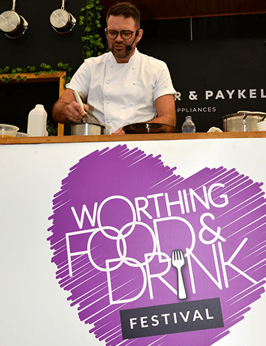
  • Logo design for Worthing Food and Drink Festival, shown with Masterchef Winner, Kenny Tutt from Worthing. This logo is used on event uniforms, branding, advertising.
  • Logo design for iESEs suite of Local Government apps. The colours are from iESE’s brand guidelines which we also created.
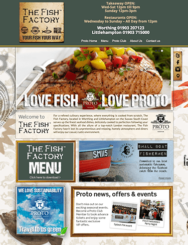
  • Logo and website design for Proto Restaurant Group. We designed The Fat Greek logo from an open brief. We created a rustic ‘flame grilled’ feel and incorporated a Greek tone.
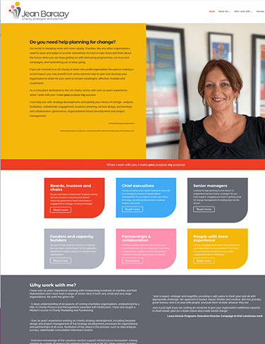
  • Website design, logo design and brand coaching for charity strategist, Jean Barclay.
  • Logo design for Hunters Recruitment – an established business. It is important to capture the success of a business when working on rebrands.
  • Logo design and brand guidelines for trade union, The National Federation of Sub PostMasters. 
  • Logo and website design for Intech Controls – a BMS Controls business based in Horsham, Sussex.
  • Rebrand for Suzuki Rhino. You may recognise the Rhino from the wheel covers of 4×4 Suzukis. We evolved the original logo by integrating it with the word Rhino.
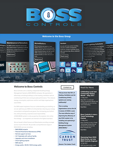
Brand launch event for Boss Controls - BMS controls and energy management business helping clients achieve Net Zero
Food festival logo design - Kenny Tutt - Worthing Town Centre Initiative
suzkuki rhino logo design rebrand
Website and logo design - Proto Restaurant Group
Charity Strategist website design for Jean Barclay
Logo design hunters recruitment shoreham business
Trade union rebrand - National Federation of SubPostmasters
Logo design and branding for BMS Controls and energy management business